This exercise assumes familiarity with the concept of Non Metallic Metal (NMM). The intent is to provide some practice with choosing light placement and identifying core shapes.
You can jump to the Exercises if you don’t need any explanation!
Light Placement
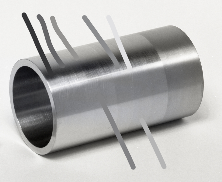
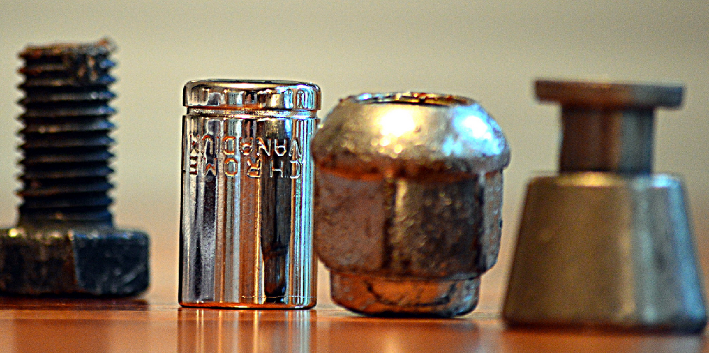
Lets take a look at a metal cylinder. This is one of the basic shapes we see fairly often in models, given that limbs, fingers, and torsos largely take this shape. So, for NMM purposes, you’ll likely be thinking cylinders for a lot of armor pieces, as well as weapon hilts and (if you’re into more than Kingdom Death), gun barrels.
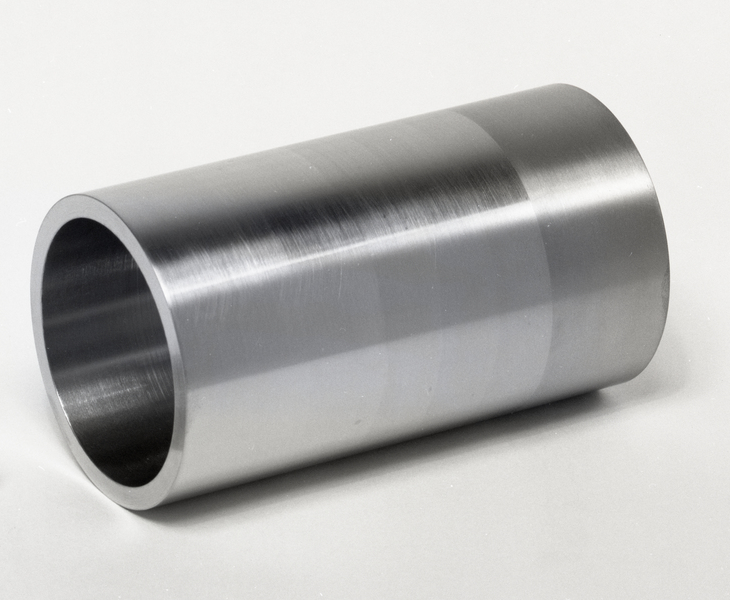
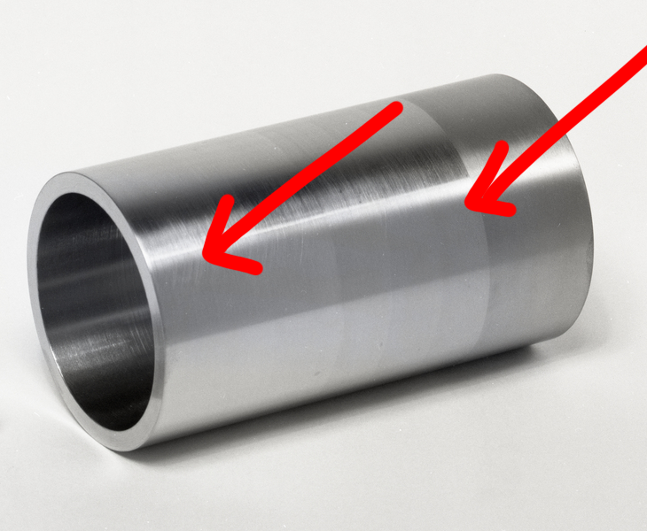
Let’s first take a moment to figure out the light direction. Given the brightest point, we can make a few guesses: that there was at least one light, and it was off to the right and high up, but not fully overhead, since there is not an additional bright line at the highest point of the curve. To illustrate, we’ll add some arrows pointing in the direction of the light
Now, we can see value changes on the lower half of the cylinder as well; this is a reflection of the table. When painting, you should consider whether you want to use the “implicit surroundings” of your figure and reflect the color of the environment, or use a neutral color such as white.
Either way, you can see that the reflection of the surface it is on only reaches about halfway “up”. A cylinder curves up and away from the surface, so that is the point at which the light bouncing off of the table and onto the cylinder stops.
For now, we are ignoring the inside of the cylinder, as generally speaking our cylindrical objects have stuff inside of them. The tl;dr is that it is much darker since the light source doesn’t touch it directly, but metal is quite reflective so light bouncing off the table and in fact the rest of the cylinder produces another bright line there.
In miniature painting, you are in control of the direction of the light, of course. Knowing how to identify light direction in references will help you determine how to use or mentally adjust them for your own work.
It is always important to keep in mind the placement of your lights, both in terms of the explicit (object source) and implicit (‘off camera’) lights. For truly effective NMM you will want to be consistent, especially if you have multiple metal objects.
Hue and Value
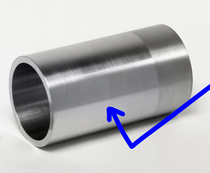
With digital references, we have a very fast way to pick out our hues and values: the eyedropper tool in pretty much any art or image manipulation program. Doing so for this image gives us a good place to start when picking out or mixing paint. However, it’s important to remember that the color picker is choosing individual pixels, which may only form the color we “see” in context with the surrounding ones. If a color looks really funky, pick a few in the same area and see if there is a kind of middle ground you can identify.
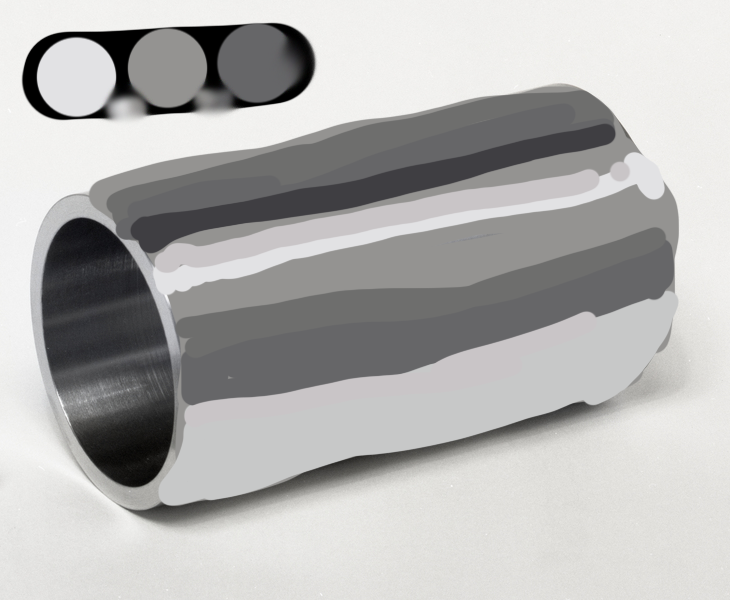
If we arrange the colors in value order, we can see a few things: there’s negligible difference between the middle three values, and we have nearly every value from white to black. There is some hue variation, but it’s fairly subtle.

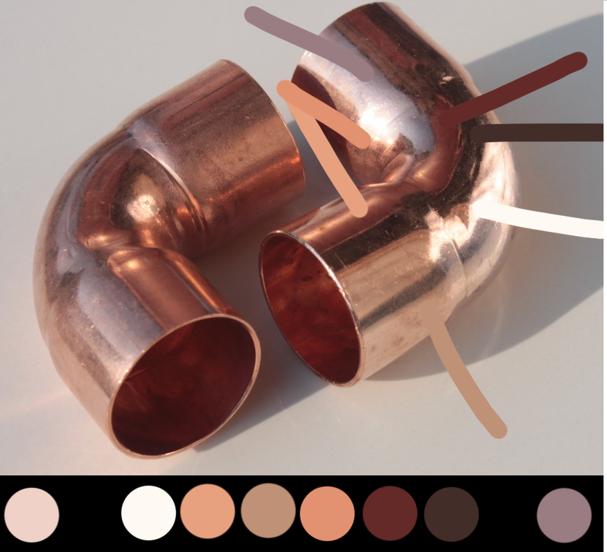
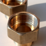
If we look at some copper pipes we can see how this helps with colorful metals as well; here the far left and far right dots are from a secondary environmental light, so have been separated from the “core”.
Now we have broken down the colors, we can simplify our palettes. Anything fairly close together doesn’t really need to be represented individually when we paint, and don’t forget that blending is going to do some of the work for us in terms of representing value.
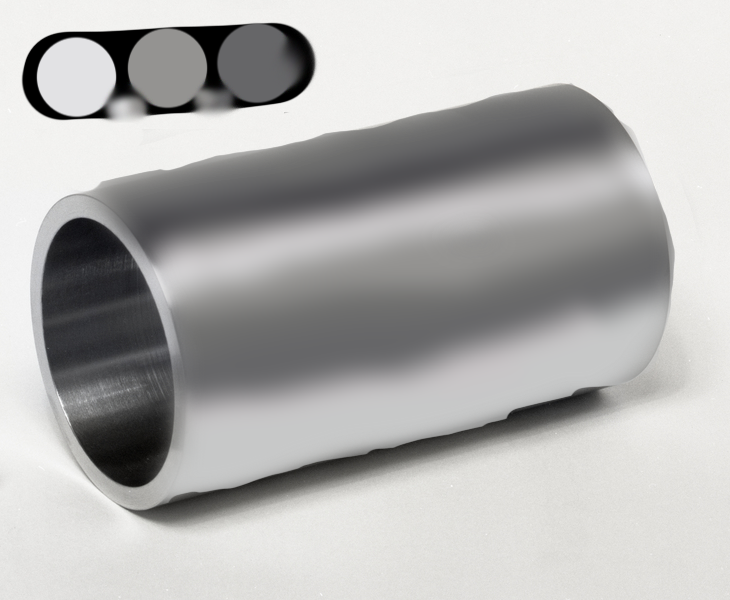
So for the grey palette, you might only pull four colors: white, a medium warm grey, a darker cool grey, and black. The white and medium grey will cover the first two colors, then the medium grey can be used for the three in the middle, the sixth color would be covered by the cool dark grey, and adding black to that will give you your darkest color. Here’s how it looks if we color over top of the image using just those four, with additional values brought in by mixing. Here we’re ignoring the slightly rougher portion of the cylinder, which reflects light differently.
Is it beautiful and metallic? No, but it’s also not blended literally at all. With some digital cheating we can get something that doesn’t look too shoddy (bearing in mind this a single, quick pass). On a model, we would generally go back in and re-emphasize the brightest highlight, as well as introducing more of the black into the darkest area. This is to do with exaggerating contrast at scale, so that it still looks good from further away. After all, your model will only really be seen up close in photos!
Unfortunately for all of us we have to blend and glaze our paint by hand, and also paint in 3D! but the theory is still sound: with four paints and some studied light placement, you can get to a pretty effective approximation of metal.
With all of this in mind, think about how you would approach simplifying the copper palette. What colors fall between two of the others and could be achieved via mixing and blending?
Practice Exercise: Hue and Value
Presented here are a variety of images; you can use them, or look around your house for metal objects. Take some time and identify the direction of light (or lights!) and picking out the hues and values. What colors can you combine as close together in hue or value? You can use digital tools or not, per your preference.
Then, it’s time to get out your paints, and sit down to try and replicate the colors and values you see. A piece of paper is fine for this portion of the exercise if you don’t feel like committing paint to a model right now, and remember — color is strongly impacted by context, so exact matching is not strictly necessary. However, strive to get close, since you’re practicing anyway!
Practice Exercise: Light
For this exercise, we’ve prepared what amount to coloring book pages. Here, the direction the light is from is identified for you. Feel free to open these up in a paint program or print them out/reproduce them as you see fit, and block in where you think the highlights, midtone, and shadows belong. You don’t need to worry about blending for this part, but bear in mind on the model, transitions between values is an important part of selling the illusion.
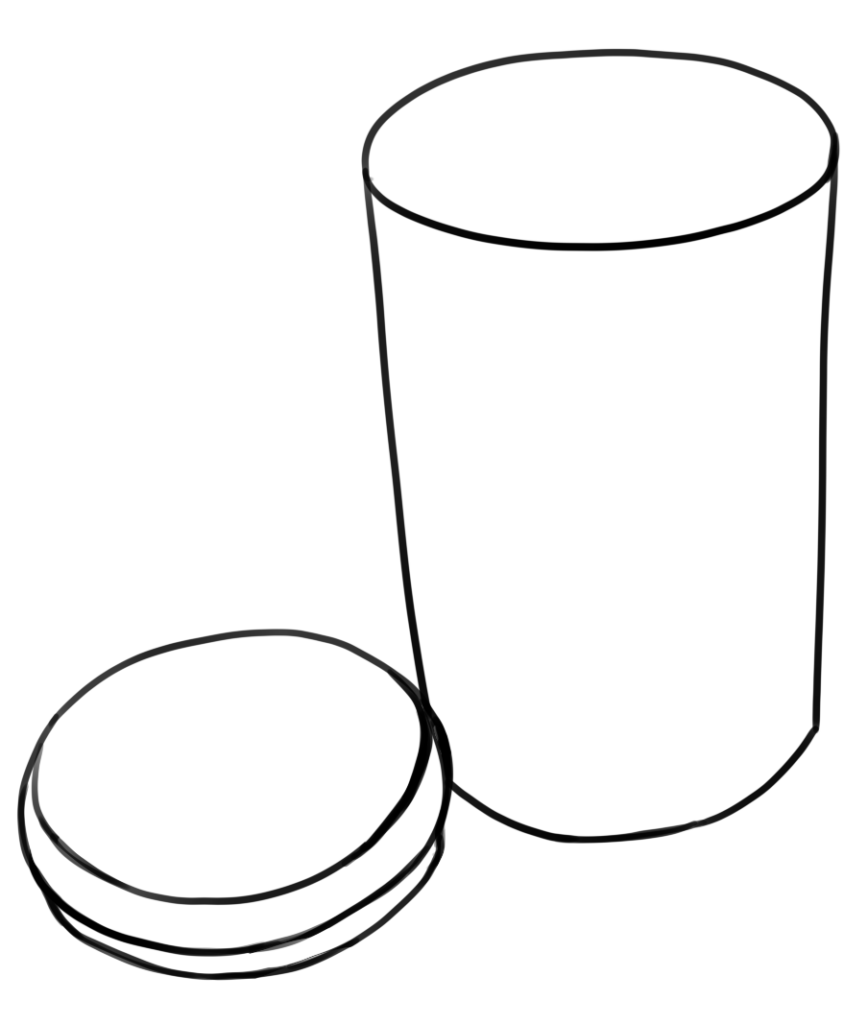
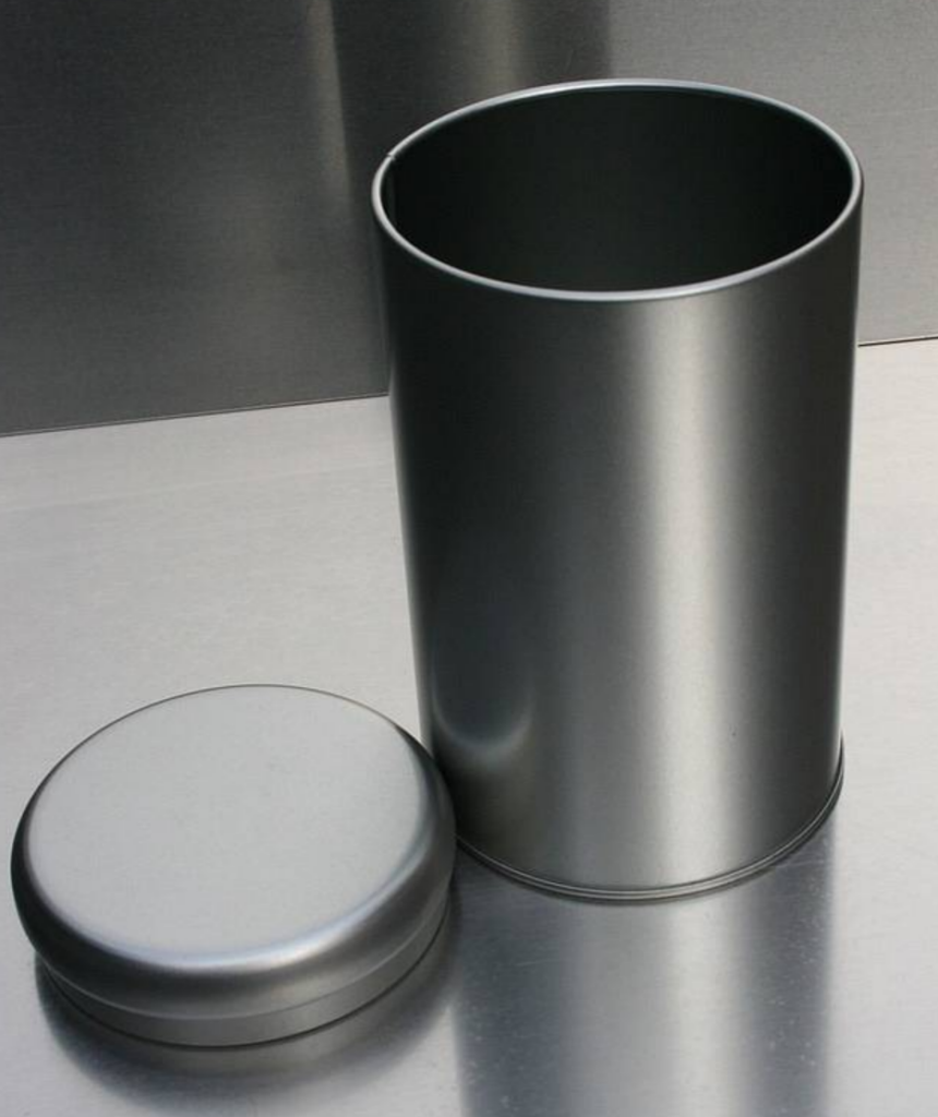
Line art of a trash can with a lid next to it.
The light is coming from just off of the center of the right, and above
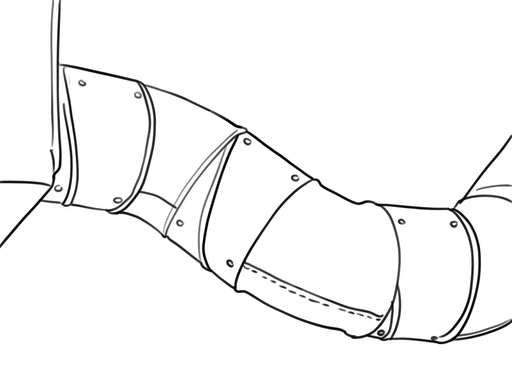
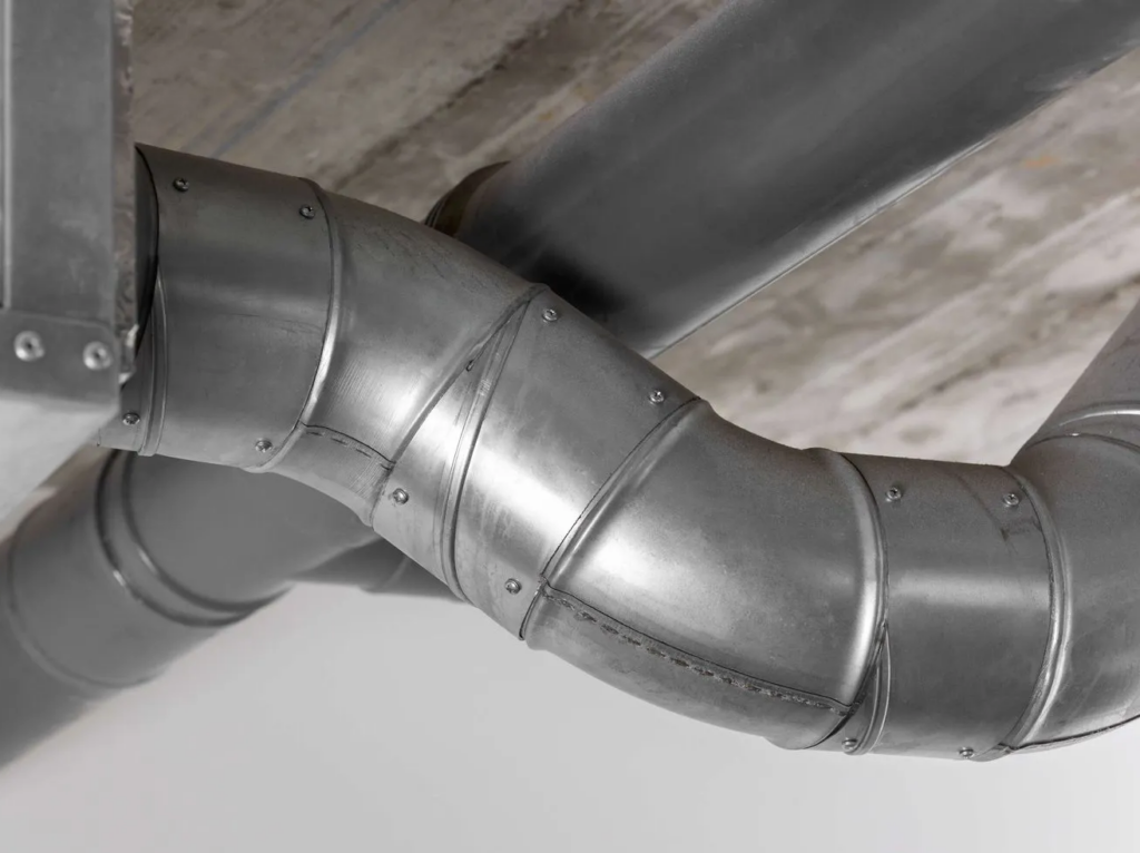
Line art of duct work.
The light is coming from below and slightly to the left of center.
Answer Key
Answer Key